CRYSTAL DESIGN SYSTEM
Over the years, our company has recognized an increasing need for a well-defined and updated design system. When the organization embarked on a significant rebranding and asset realignment initiative, we seized the opportunity to establish a new design system. This system aims to align current and future web products under consistent standards and foundational assets.
The Problem
As an organization, we've undergone mergers with several companies, resulting in an ecosystem of web apps that lacked cohesion in behavior and functionality. Developing a new design system serves as a guiding framework for implementing these interfaces. It also establishes a foundation for new products, ensuring cohesive and standardized deliverables.
My Contribution
Throughout the project's evolution, my role underwent significant changes. Initially part of the User Experience team, I contributed to planning the overall project and laying the initial building blocks for the Token, Figma, and CSS projects. As my career transitioned into a more developer-centric role, I focused on contributing to the Token library, CSS framework, and Angular library. Meanwhile, the UX team maintains the Figma library and oversees the product designs, contributing to the continuous expansion of content within the system.
Initial State
Our initial state was a collection of web apps that were built by different teams, with different technologies, and built with different design standards. This resulted in a disjointed experience for our users, and a disjointed experience for our developers. This was especially an issue for users who had to use multiple apps, and had to learn how to use each app individually. To fix this, We needed to document and unify our design standards, and build a system that could be used by all of our teams.
A New Unified Design
Crystal was built with multiple modalities in mind. we wanted to make sure that any team working at Clario could have applications designed and implemented easily using this new system as its core. Two key considerations that guided our work was ensuring that designs are flexible and not tied to a specific modality, and secondly, that our decisions were recorded as design tokens. From there, we built out the structure of the system as 5 main projects, each with their own purpose and goals.
- Token Library
- Figma Library
- Icon Library
- Custom CSS Framework
- Angular Component Library
1. Token Library
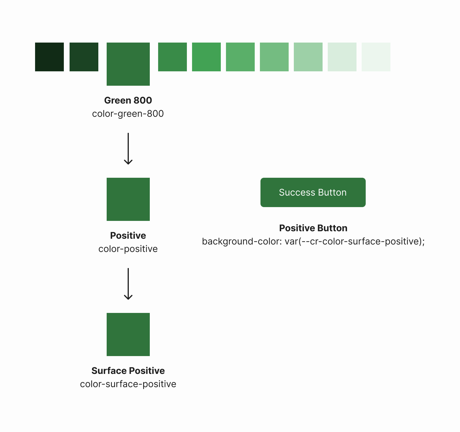
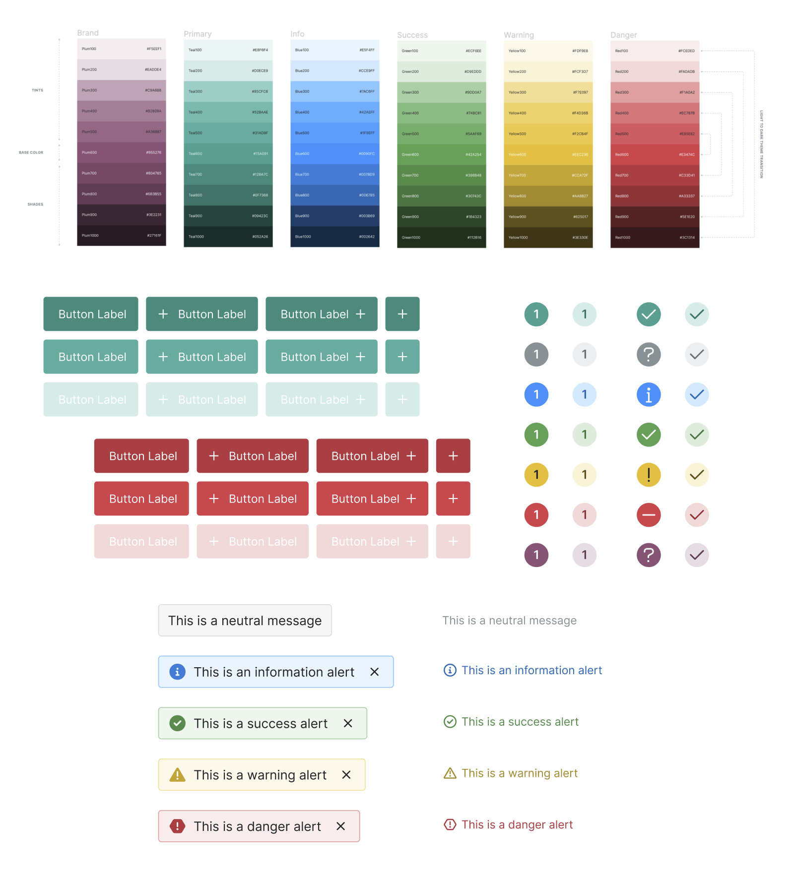
A Token library is a collection of design tokens that are used to define the look and feel of a design system. These tokens are the core of our design system, and are used to define the colors, fonts, spacing, and other design elements that are used throughout our system. We built our library using Style Dictionary. From here, our design system's core values and tokens can be propagated out to the different projects within the system to ensure consistency and a single point of truth.
2. Figma Library
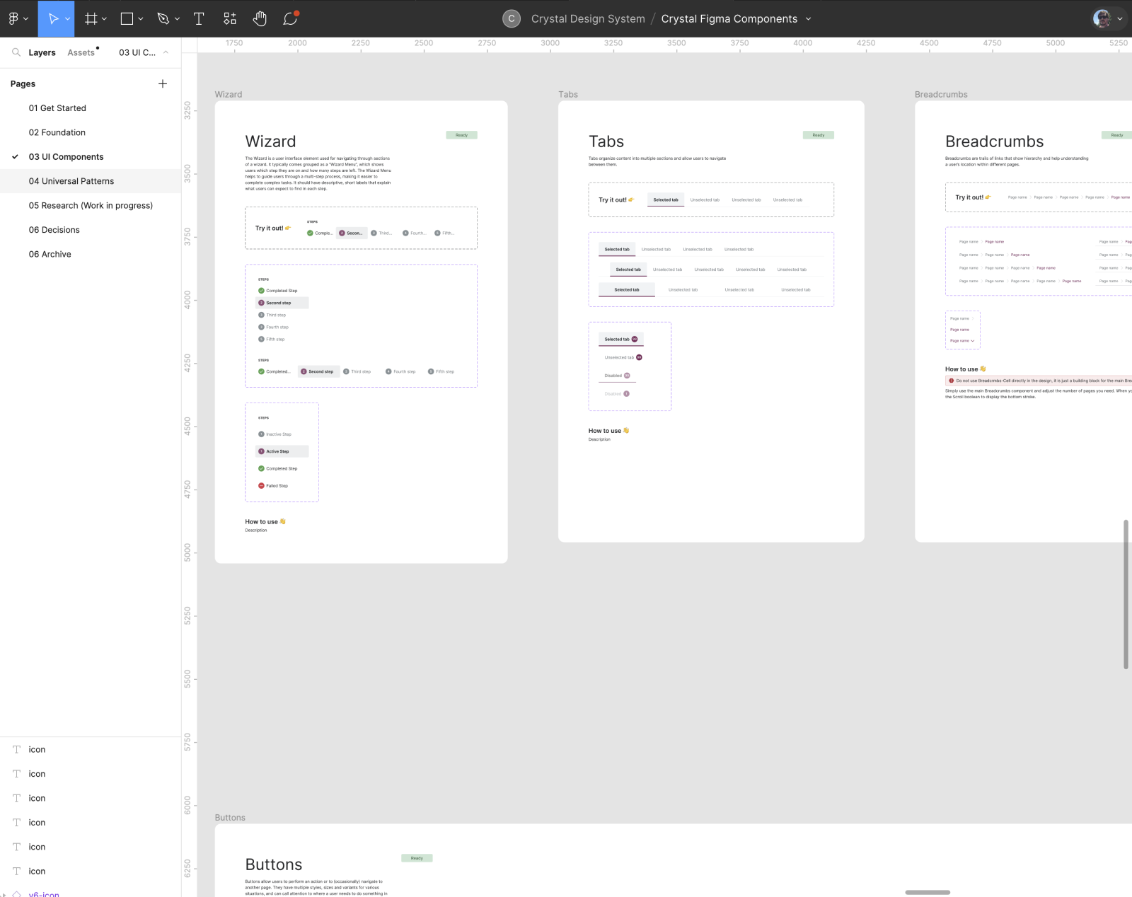
Our UX Team maintains a Figma Library, consisting of components, layouts and mockups of our UI solutions using the Design system. These designs directly refer to our tokens, CSS and Angular components to provide unambigous requirements for product teams.
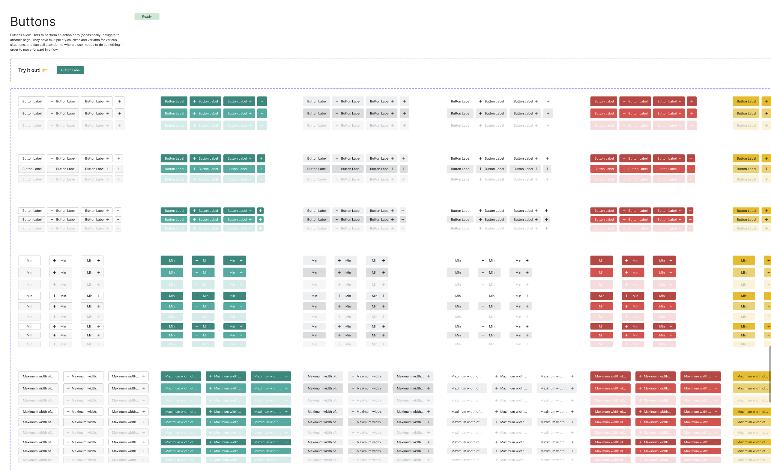
Our sleak new components streamline the design process, ensuring a cohesive and polished user interface. Easily adjustable for various states and styles, this component example simplifies button creation while maintaining a unified brand aesthetic while providing the full breath of functionality required by our products.
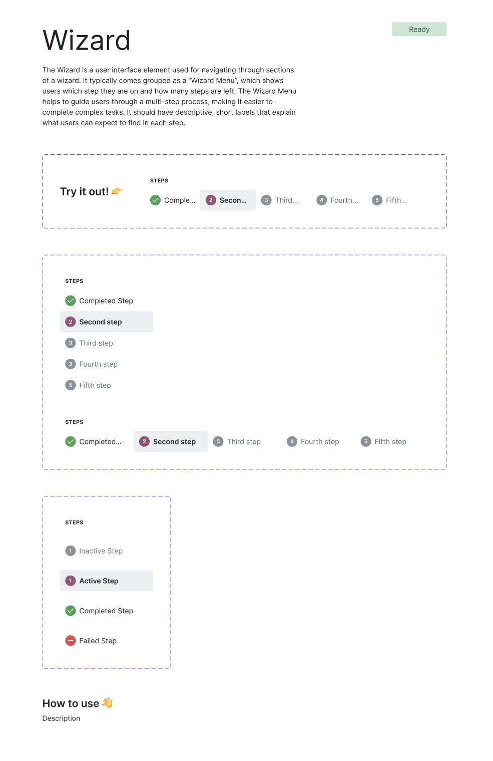
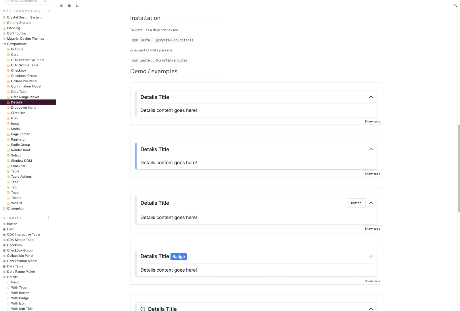
This wizard component offers a compact design that enhances the overall user experience by breaking down intricate tasks into manageable steps. Our library has 30+ components for designers to use as part of their process of designing and creating interfaces for our products.
3. Icon Library
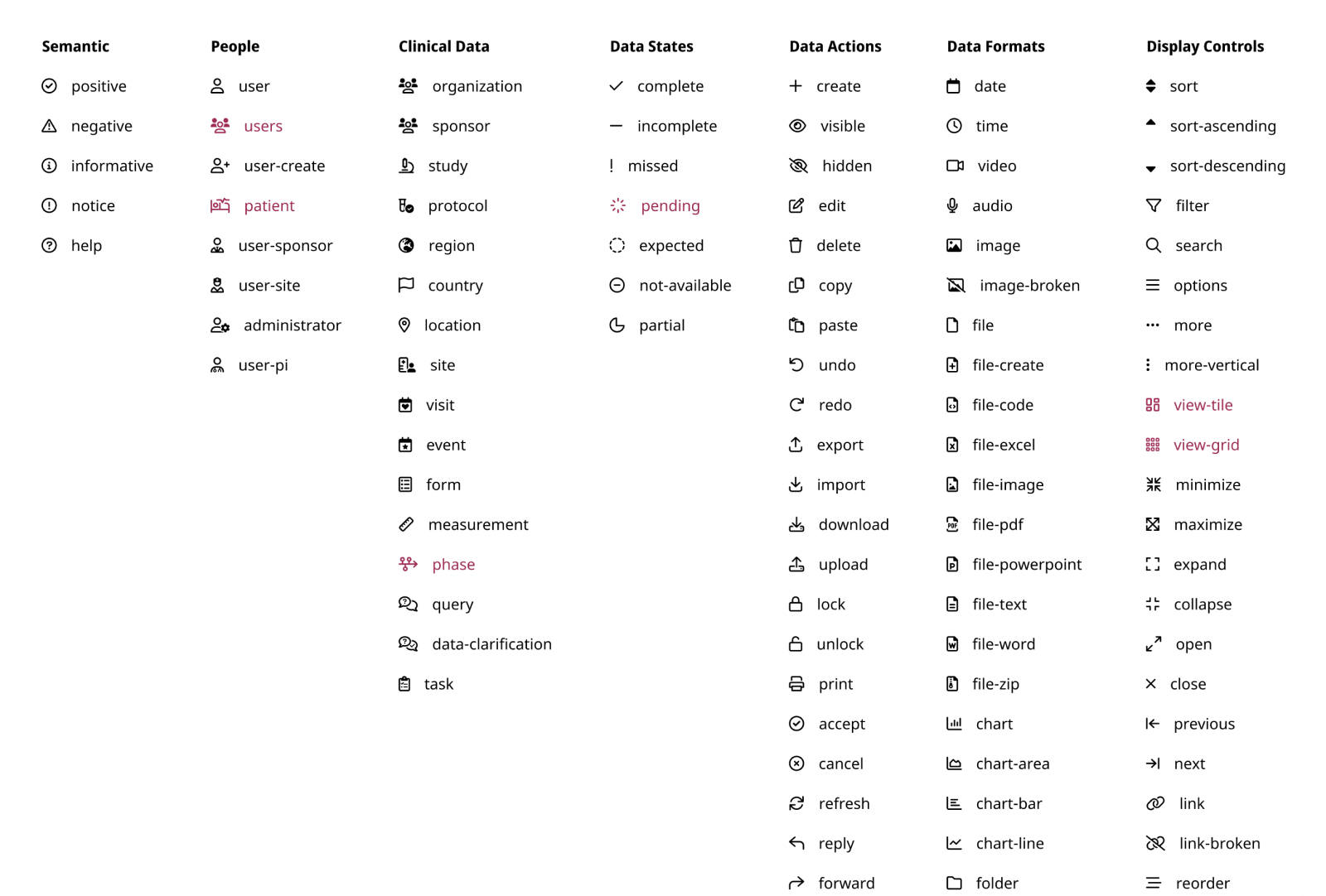
We decided to use Font Awesome for our icon library, and have integrated the package with all of our projects. Additionally, we support and serve custom icons as part of the Font Awesome package. Both are released through a private npm package, and are available to all of our projects. This allows us to have a single source of truth for our icons, and allows us to easily update and maintain them.
4. Custom CSS Framework
Significant effort has been invested in translating our Figma designs into a versatile and accessible collection of CSS components. This framework is implementation-agnostic (suitable for projects not utilizing the Angular framework) and is enriched with a robust set of utility classes. These classes empower developers to seamlessly integrate product code with minimal reliance on custom CSS.
Documenting Basic Concepts
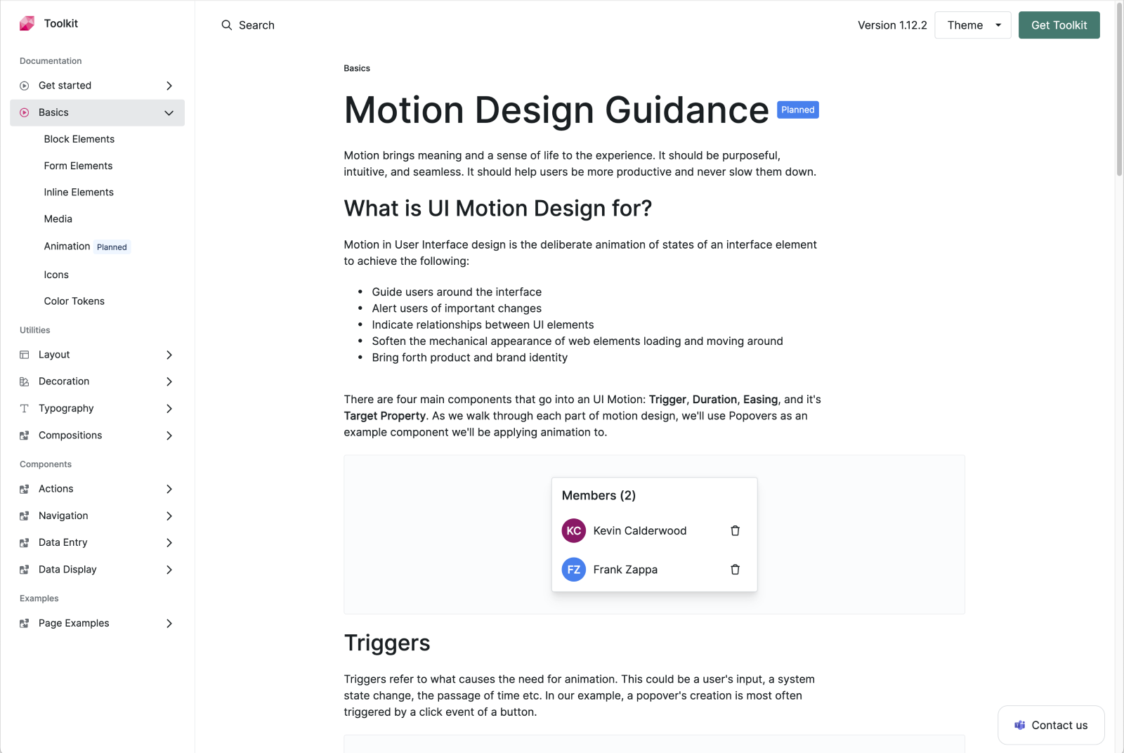
Fundamental concepts and ideas are elucidated at the outset of the documentation, such as this Motion Design example.
Utility Classes
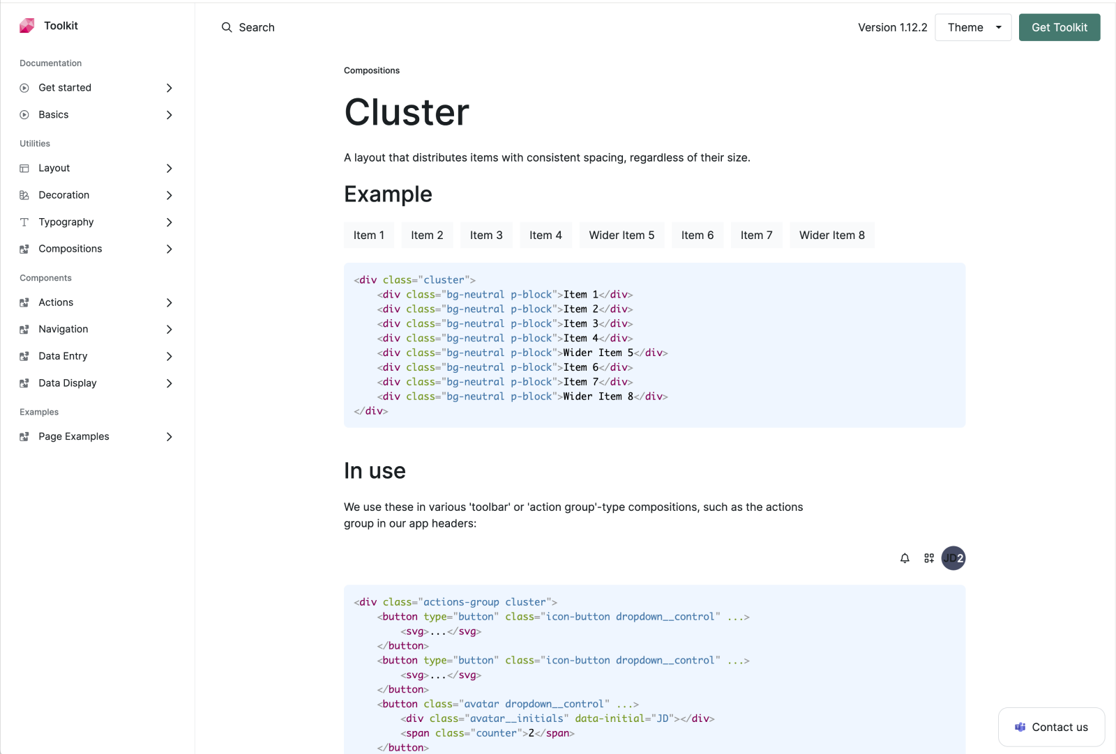
In addition to pre-built components, our framework offers an array of utility classes, exemplified here in the efficient management of content clusters.
Components
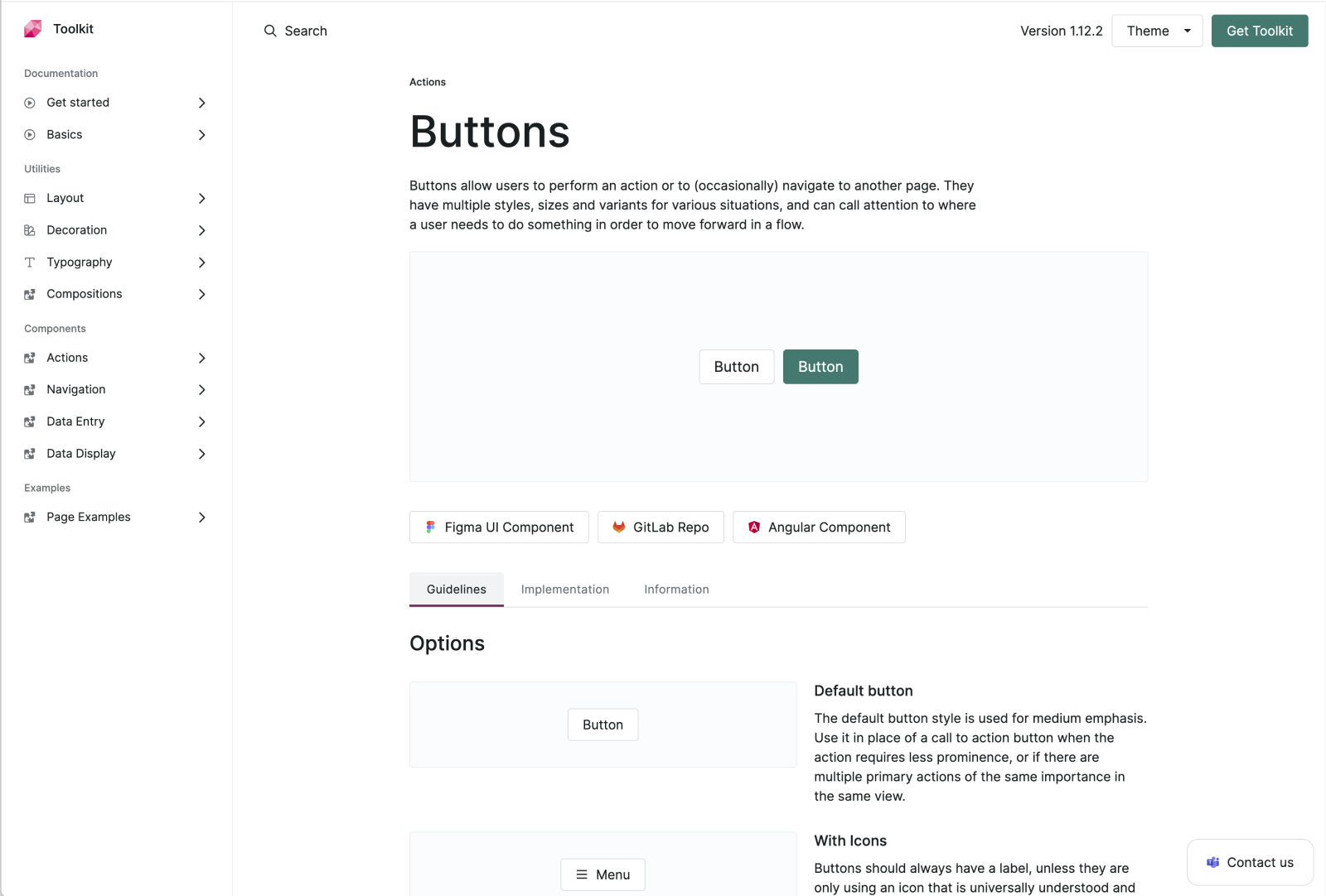
Toolkit components are meticulously crafted to align with the elements found in Figma design files. Documentation, like the example below, details the usage and customization options available for button styles.
Page Examples
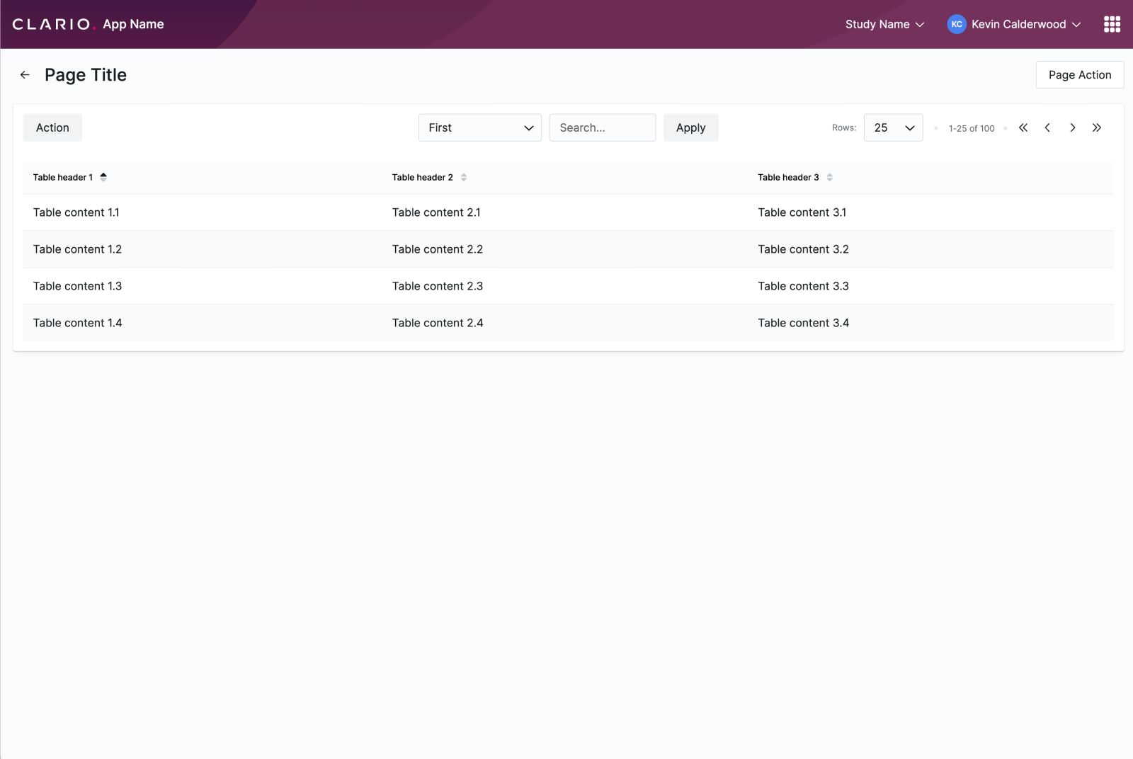
Page examples are also part of the toolkit, showing how product pages can be built and laid out using purely the css in the toolkit and html.
5. Angular Component Library
Finally, our project encompasses a reusable Angular component library. A collaborative effort involving individuals from diverse product teams ensures the ongoing development and maintenance of components, continuously enhancing our capabilities.